word & image : identity design
This branding project was undertaken during the 'Word & Image' course
module, where we had the opportunity to select a live project. It marked my
debut in identity design. The task encompassed comprehending the company's needs, product, and communication objectives, and delivering
a suitable visual identity approach.
course assignment & client work
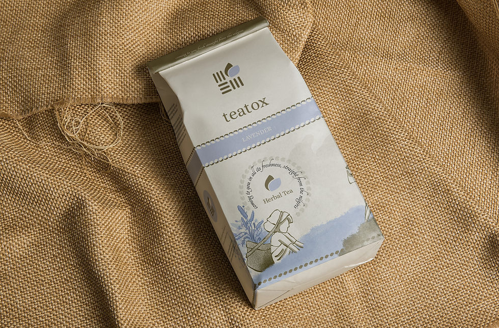
product chosen: teatox herbal tea
Teatox is a Bengaluru based herbal tea start-up sourcing its tea from the hills of Ooty, Tamil Nadu.
requirements of the brand
The startup needed design work for their herbal tea line, including a logo, label, and paper box.
key words
premium
raw
natural

processs
Embracing Indian aesthetics, teatox draws inspiration from the tea plantation workers and the baskets they use to collect leaves. The intricate weaving patterns of these baskets, which vary across regions, serve
as a symbol of the natural and raw essence of tea, representing its initial point
of contact before processing.
.png)
basket weave patterns
Teatox aims to position itself on par with existing tea brands in the market, all while striving for greater affordability. The logo design needed to capture the essence of natural derivation and the personal touch
of basket weaves, cleverly incorporating intertwined T's within the patterns.


Beginning with the outlines
of the woven patterns, rearranging negative and positive spaces to highlight the T's in a symmetrical, simplified form, making
the 'T' in Teatox prominent.
By reconfiguring these
spaces, minimizing
connecting lines, and
creating an overall square shape, aimed to symbolize
a collecting basket holding tea leaves.

Continued to experiment with squares on a different weave, exploring various ways to simplify it into a logo through iterations from 1 to 2 to 3.
The ultimate design is a simplified, symbolic basket that creates the illusion of holding leaves, aligning with brand requirements and motto.
1
2
3
exploring pattern
4
the final form
the grid

observations

To achieve optical symmetry, manual adjustments were necessary due to the logo's asymmetry. Shifted the logo mark to the right to ensure alignment with the word mark and surrounding basic shapes.
exploring the typeface

louvette banner
tangerine
canto italic
Alice regular


packaging illustration


paper cover packaging and label